Curtains
These are generated — a few hundred near-vertical strands per sheet, all sharing one smooth displacement field. That shared field is the whole trick: neighbouring strands move together, so it reads as cloth instead of noise. The dark creases aren't drawn anywhere. They're just where the field compresses hard enough that strands pile up and the ink stacks. Colour is assigned by where a strand starts, so it travels with the fold rather than sitting still on the page.
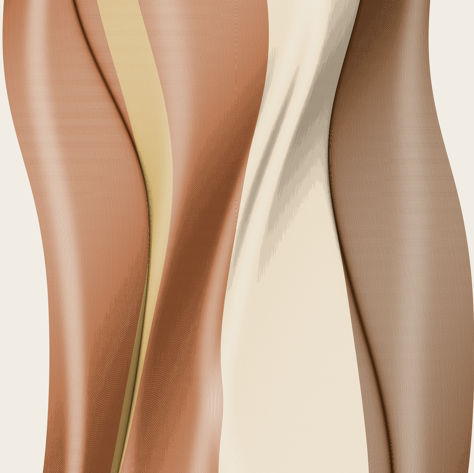
Cream and rose
The quietest of the four. Warm neutrals, and wide enough passages that you can see the paper between the strands doing the shading.
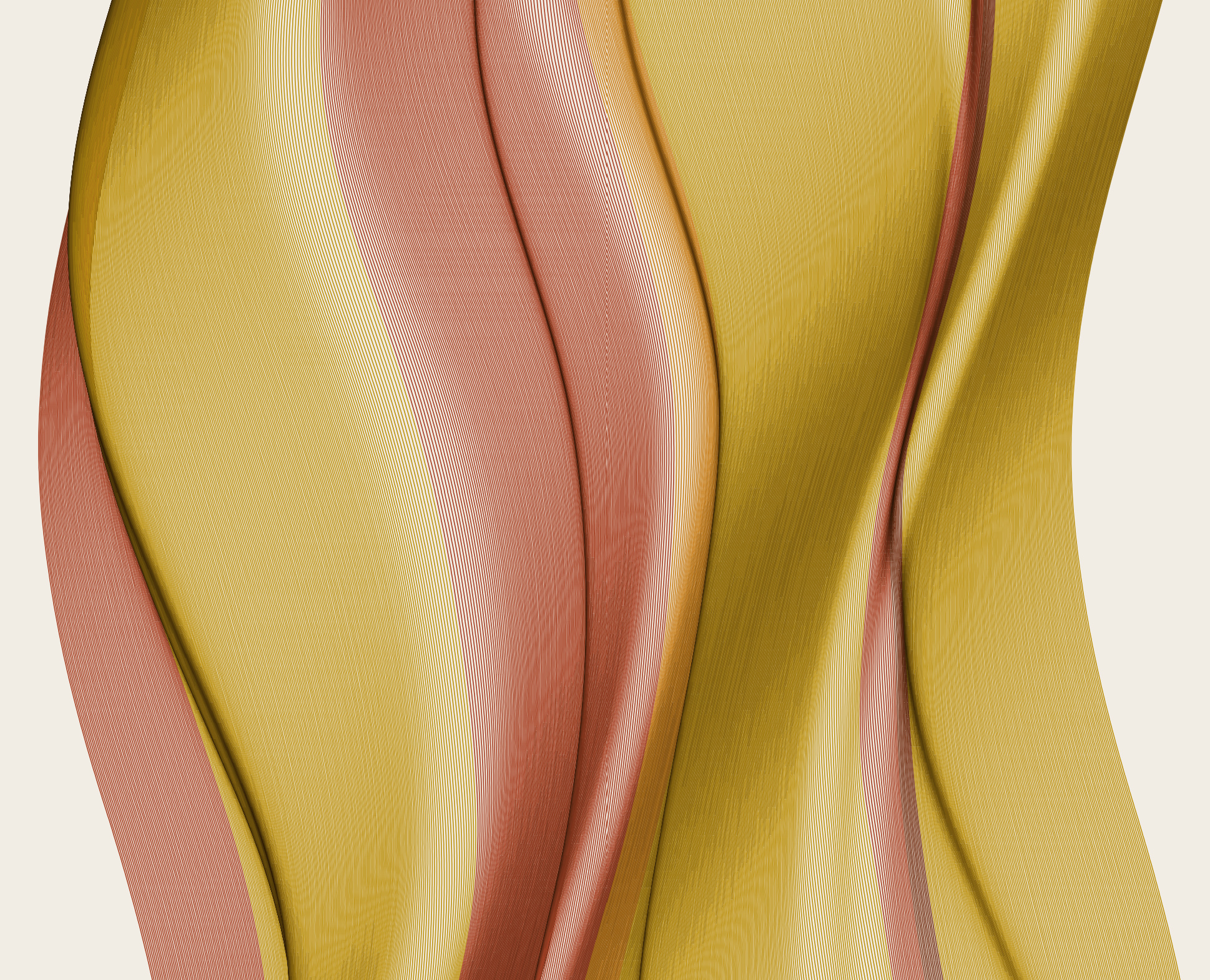
Gold and coral
Gold against coral. The strands bunch almost to solid along each fold — that near-black is stacked ink, not a darker pen. Ochre and brick were chosen because they actually collapse toward black when layered; a pure yellow never gets past orange no matter how many times you multiply it.
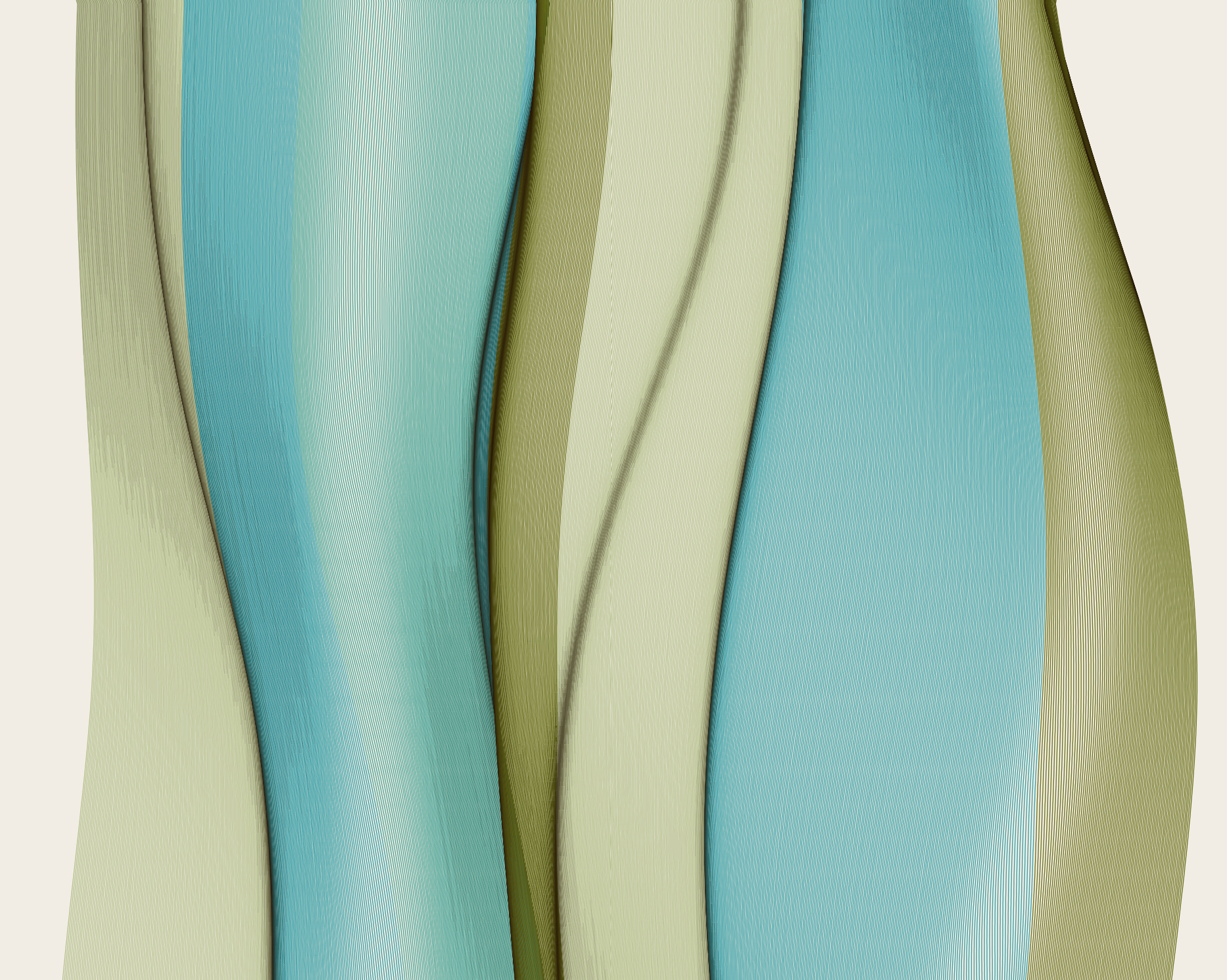
Teal and sage
A cooler register, and a good example of stretch: where the field pulls strands apart the paper shows through and you get a highlight for free.
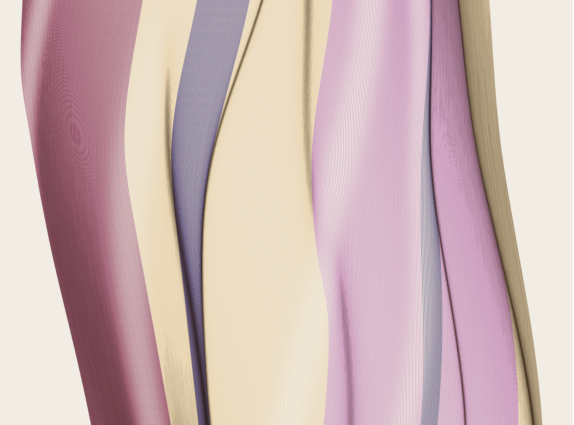
Lilac and blue
The most crowded of the set — more fold events across the same width, so it reads as pleating rather than drape.