This is an update to the original (several years old now) psutil and MongoDB for System Monitoring
The code for this article and the other two parts is now available on my GitHub Repo
The old version is the python2 branch.
The default branch (master) has the code
we’re going over in this article.
Introduction
This three-part article enables you to create your own system-monitoring web page.
Part 1 introduced the project and covered the Python data gathering part: DIY System Monitoring, Part 1: Python
Part 2, covered the Node/Express web server DIY System Monitoring, Part 2
Part 3, this part, covers the JS/HTML front-end, DIY System Monitoring, Part 3: Visualization
Setting up Javascript Code
Last time we set up the NodeJS server so we can query the data in the MongoDB database.
Also we set up an static directory for the server to provide static files like
HTML and Javascript. So this code will go into static/js/mychart.js. See the GitHub
layout for complete details.
First, here’s a helper function to “humanize” the sizes we have in memory and disk space. It will abbreviate the number and add the appropriate unit next to it.
function formatBytes(bytes, decimals) {
    if (bytes == 0) return '0';
    const k = 1024,
        dm = decimals <= 0 ? 0 : decimals || 2,
        sizes = ['Bytes', 'kB', 'mB', 'gB'],
        i = Math.floor(Math.log(bytes) / Math.log(k));

    return parseFloat((bytes / Math.pow(k, i)).toFixed(dm)) + ' ' + sizes[i];
    }
Next, in getApiData, we make our call to the server for a specific machine name.
- Set up the properties on our new data structure
data - Make the call to the NodeJS api. This uses
fetch, a cool interface for fetching resources. MDN fetch docs
Most of this code is just pushing data from MongoDB structure into our Javascript structure.
async function getApiData(machine) {
    let data = {};
    data.name = machine;
    data.listening = '';
    data.cpu = [];
    data.mem = [];
    data.disk_root = [];
    data.disk_app = [];
    await fetch("http://myserver/api/load/" + machine)
        .then(stream => stream.json())
        .then(mydata => {
        data.listening = mydata.slice(-1)[0]['myapp'];
        mydata.forEach(record => {
            data.cpu.push({
            y: record.cpu,
            x: record.date
            });
            data.memory.push({
            y: record.memory,
            x: record.date
            });
            data.disk_root.push({
            y: record.disk_root,
            x: record.date
            });
            data.disk_app.push({
            y: record.disk_app,
            x: record.date
            });
        });
        });
    return data;
    };
The one thing that’s not so obvious is this line:
data.listening = mydata.slice(-1)[0]['myapp'];
We have a bunch of data coming at us in an array and this picks off the last one. Since this is capped collection, we get the data in order, so by pulling off the last item in the array, we have the latest info from our machine.
Our array is mydata, so mydata.slice(-1) picks the
last set of records in the array. The [0] gets the first element of
the set. So the slice(-1)[0]['myapp'] gets the boolean showing if the
port is listening. That value will be ‘true’, ‘false’, or ‘null’
(see the load_data.py script for details).
Now we’ve got the data, we just need to configure Chart.js so we can look at it.
From the documentation at Chart.js, the library provides:
Simple yet flexible JavaScript charting for designers & developers … It’s easy to get started with Chart.js. All that’s required is the script included in your page along with a single
canvasnode to render the chart.
function makeChart(machine, data, kind) {
    var ctx = document.getElementById(machine+kind);
    let maxY = 100;
    switch (kind) {
        case 'cpu':
        maxY = 100;
        break;
        case 'memory':
        maxY = 32000000000; //32gb
        break;
        case 'disk_root':
        maxY = 50000000000; //50gb
        break;
        case 'disk_app':
        maxY = 100000000000; //100gb
        break;
    }
In the makeChart function, we will call it for each chart we want.
And we want one chart for each combination of machine/kind, where kind
is cpu, memory, disk_app, or disk_root.
This portion finds the div to display the chart and sets some display options. You could set whatever you like here; all I needed was to set the maximum Y value so all the charts of the same type are scaled identically, for comparison.
We will make sure there are divs in our HTML page with an id that specifies
the machine name and the kind of chart we want.
Now to create the actual line chart:
    new Chart(ctx, {
        type: 'line',
        data: {
        datasets: [{
            label: kind,
            data: data[kind],
            borderWidth: 1.0,
            borderColor: 'navy',
            pointRadius: 0,
            pointHitRadius: 3,
            fill: false
        }]
        },
Here we’re loading in the data of the appropriate kind with some
display options. There’s a lot you can play around with here for making
your chart look nice. The main thing is that the data is structured correctly
so the library can understand it. We created it with the right structure to begin with,
so no worries there.
        options: {
        legend: {display: false},
        title: {
            display: true,
            fontSize: 10,
            fontColor: ((data.listening === true || data.listening === null) ? 'green': 'red'),
            text: machine + ' (' + kind + ')',
        },
See how the title changes to green if the machine is up? That little bit of code makes it easy to see when a problem occurs: the titles on the charts for that machine light up in red.
        plugins: {
            zoom:{
            zoom:{
                enabled:true,
                drag:true,
            }
            }
        },
        scales: {
            xAxes: [{
            type: 'time',
            time: {
                unit: "hour",
                displayFormats: { hour: "dddhA" },
                tooltipFormat: "MMM. DD ddd hA"
            },
            ticks: { autoSkip: false, maxTicksLimit: 5, fontSize: 8},
            position: 'bottom'
            }],
            yAxes: [{
            ticks: {
                fontSize: 8,
                suggestedMin: 0,
                suggestedMax: maxY,
                callback: function(value, index, values) {
                if (kind === 'memory' || kind === 'disk_root' || kind === 'disk_app') {
                    return formatBytes(value, 1);
                } else {
                    return value
                }
                }
            }
            }]
        }
        }
    });
    return data;
    }
I wanted the ability to zoom in on a chart so I added the zoom plugin.
I added some axis options (including the maximum Y value we calculated at the beginning).
For memory and disk space I send the value through the formatBytes function to make
it easier to read and understand.
All Together
Our HTML looks like this:
<!DOCTYPE html>
<html>
<head>
  <script src="https://cdnjs.cloudflare.com/ajax/libs/moment.js/2.22.2/moment.min.js"></script>
  <script src="https://cdn.jsdelivr.net/npm/chart.js@2.8.0/dist/Chart.js"></script>
  <script src="https://cdn.jsdelivr.net/npm/hammerjs@2.0.8"></script>
  <script src="https://cdn.jsdelivr.net/npm/chartjs-plugin-zoom@0.7.0"></script>
We load the libraries we need from the CDNs.
  <style>
    .myserver {
      height: 300px;
      width: 900px;
    }
    canvas {
      height: 275px;
      width: 400px;
      background: ghostwhite;
      float: left;
    }
  </style>
  <title> Build Cluster Load Monitoring</title>
</head>
Set some CSS for the chart display. I made the chart divs kind of small so I can fit four
charts in a row in the browser. That is small but it works fine for me, all I need is
a glance. And with the zoom plugin, I can get a more detailed look if needed.
<body>
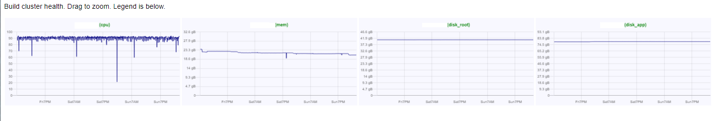
<p style="font-family:sans-serif">Build cluster health. Drag to zoom. Legend is below.</p>
<div class="myserver">
<table>
<tr>
<td><canvas id="myserver00cpu"></canvas></td>
<td><canvas id="myserver00memory"></canvas></td>
<td><canvas id="myserver00disk_root"></canvas></td>
<td><canvas id="myserver00disk_app"></canvas></td>
</tr>
<tr>
<td><canvas id="myserver01cpu"></canvas></td>
<td><canvas id="myserver01memory"></canvas></td>
<td><canvas id="myserver01disk_root"></canvas></td>
<td><canvas id="myserver01disk_app"></canvas></td>
</tr>
</table>
You can repeat that div for as many servers as you like. I have two servers here,
named myserver00 and myserver01.
You can see we’re putting 4 charts into a table row, one row for each server.
Then at the end of the html, add the calls to our getApiData function
for each server and kind of chart.
    <script src="./js/mychart.js"></script>
    <script>
    getApiData('myserver00')
        .then(data => makeChart(data.name, data, 'memory'))
        .then(data => makeChart(data.name, data, 'cpu'))
        .then(data => makeChart(data.name, data, 'disk_root'))
        .then(data => makeChart(data.name, data, 'disk_app'));
    getApiData('myserver01')
        .then(data => makeChart(data.name, data, 'memory'))
        .then(data => makeChart(data.name, data, 'cpu'))
        .then(data => makeChart(data.name, data, 'disk_root'))
        .then(data => makeChart(data.name, data, 'disk_app'));
Here, I’m only showing 2 servers. In my real situation, I have one page with six servers and one page with ten.
Here’s what it looks like. In real life that image spans the browser window so it is a little easier to read. Click the image to see it full-size.
You now have little application to monitor any number of servers on whatever measurements you like (using Python’s psutil package), and you can refresh your HTML page to see the latest information.
Good luck and let me know how you’ve used your version of the app.